
Social Networking Website Twitter today rolls out its new Desktop design for everyone. Well, the design is already available for testers from past few months, but now it is publicly available for everyone. Do note that it is a mandatory design and everyone now use it when login to their Twitter Account.
I found this design very neat and clean. Also, I see improvements in Twitter Loading time on Desktop earlier, which was not too good.
Once you login to your Twitter account via Desktop you see a prompt saying Welcome to the new Twitter and also giving you options to set font size, colour and theme.
The Twitter new desktop design brings three new themes which you can set on the background of your Twitter account. These three new themes are Default, Dim and Lights Out. You can set these themes, font size, and the default colour of your twitter account by the options I show you in the screenshot below.

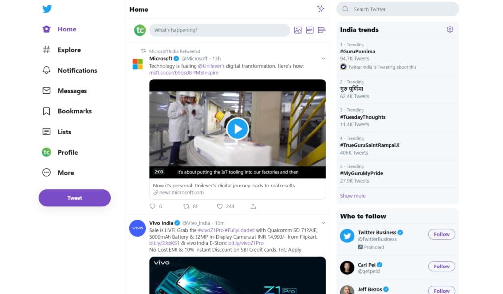
You get these options when you log in to your Twitter account for the first time in your Desktop, or you could access these options by clicking on more > display on the left navigation bar. In previous design navigation bar present at the top but here you can see it now present at the left side.
One more thing to notice in this new design is that Twitter brings some features from its mobile experience to the Desktop. For example, the Sparkle Button that let you sort tweets in chronological order and Explore Tab that helps you to get live videos and local trends around you.
Last but not least, You can now access more than one Twitter account without login and log out. Yes, the Twitter new Desktop design has now provided us with the option to add more than one account which we can switch by long pressing on the home icon. You can add more than one Twitter account by clicking on the More Tab, and there you see a + icon at the top. Clicking on this + icon lets, you add more than one account.