

Choose the setting that fits your view
Use the Docs app's theme on Android, iPhone, or iPad. Keep browser and document colors clear, then review the file your reader will receive.
Key Takeaways
- In the Android Docs app, open Menu, Settings, and Choose theme, then select Dark.
- On iPhone or iPad, open Menu, Settings, and Theme, then select Dark.
- The mobile app’s theme is your viewing choice. Google says collaborators cannot see the theme you choose.
- Keep browser appearance, app theme, and file background separate. Check the actual file before you share or print it.
To change Google Docs to dark mode, open the mobile app’s Settings and choose Dark. Android calls the control Choose theme. On iPhone and iPad, it is Theme. Google’s current help explains those mobile controls. It also shows how to preview a file in light theme.
On a computer, first identify what you want to darken. Chrome’s browser theme and a file’s page color have their own settings. Google’s Docs theme guide covers mobile apps. It does not show a matching desktop Docs menu.
Choose the control that fits your goal. A private reading choice and a dark page you intend to share need different kinds of changes.
How to change Google Docs to dark mode on Android
Use the theme setting in the Google Docs app. Google’s Android instructions give this route.
- Open the Google Docs app on your phone or tablet.
- Tap Menu at the top left.
- Open Settings.
- Tap Choose theme.
- Select Dark.
Return to the file you want to read. Look at the text, menus, images, and any table shading. The result should suit the task you are doing. You can return to the same setting to choose Light or System default.
Start from the app’s main menu if you were looking inside an open file. File controls and app settings serve different jobs. Page setup controls the file’s layout. Use app Settings for the theme choice.
If a saved set of steps does not match your screen, record which app you opened. A Google Doc in a phone browser and a file in the Docs app are different contexts. Compare your route with the Android app instructions before changing the file’s colors.
Keep your first check simple. Open a familiar plain-text file first. An image’s own background can confuse the result. You can review more complex pages after you confirm the app setting.
Set the theme on iPhone or iPad
Google’s iPhone and iPad guide uses a slightly different label for the same theme choice.
- Open the Google Docs app.
- Tap Menu at the top left.
- Open Settings.
- Tap Theme.
- Choose Dark.
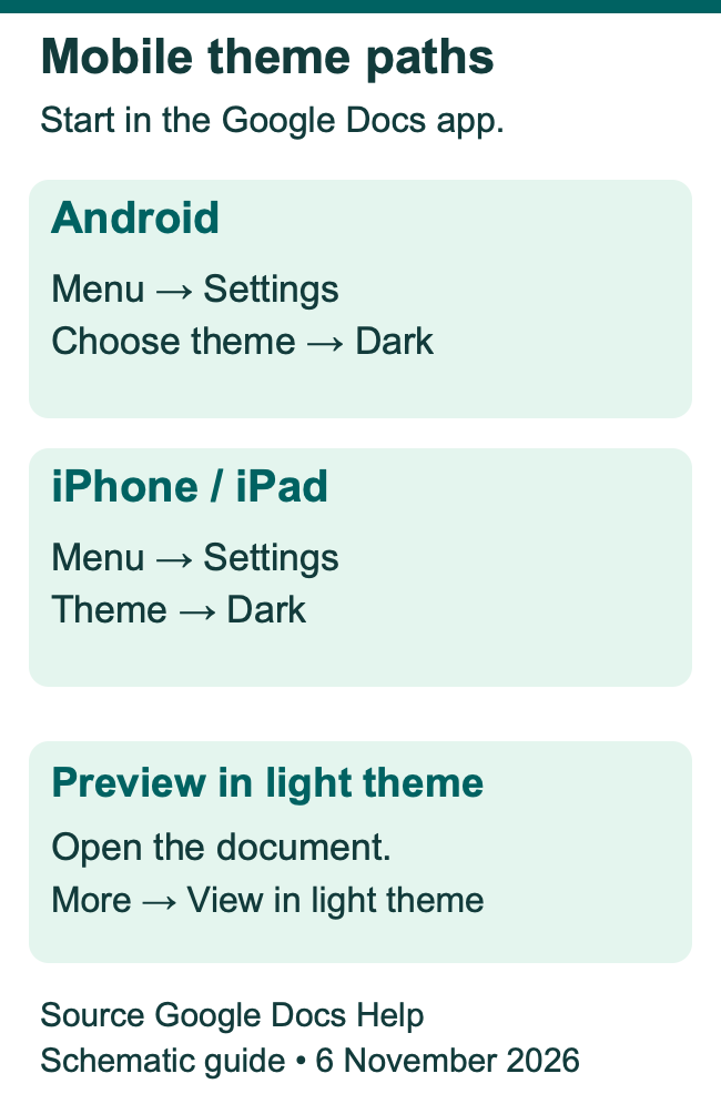
The app also lists Light and System default. Choose the setting that matches how you want this app to appear. A fixed choice keeps Docs in one theme. Other apps can follow their own routine.
Check the app you are in when you compare instructions. The Google Docs app, the Google Drive app, and a browser tab can each show a file. A dark theme selected in one place is a poor guide to the controls you will find in another.
For an illustrative example, suppose you open a file from a message on your iPad. Before searching for Theme, check whether that link opened a browser page or the Docs app. Starting in the intended app removes a common source of confusion.
If you also use an external keyboard, remember that the theme setting is still an app choice. Use the documented menu to choose it. You do not need a special format shortcut.
Decide between Dark, Light, and System default
Choose Dark or Light when you want a fixed app choice. Choose System default when you want the app’s appearance to follow the device’s theme. Google lists all three choices in its mobile theme help.
Think about the way you use the device. If you use one theme all day, a fixed choice is straightforward. You may already manage the theme on your phone or tablet. System default keeps that choice in one place.
Here is a hypothetical routine. A reader wants a dark app on a train ride. Later, they need light pages for a color review. They can pick the app theme they prefer, then use the file’s light preview for that review. The choice depends on the work, rather than a rule that one theme suits every situation.
When the appearance changes unexpectedly, note the active choice before changing anything. Does Docs show System default? Check the device’s theme too. If Docs shows Dark, start with that app setting.
This gives you a way to trace the behavior you see. Check each app’s supported settings when a different screen is the source of the problem.
Preview a file in light theme
Use light preview to review the content. You can keep your main mobile theme. Google files this control for both Android and iPhone or iPad.
Open the file in the Docs app. Tap More at the top right, then choose View in light theme. Review the text and any colors that help explain it.
Google says dark theme adjusts files and sheets to fit the viewing theme. Its light preview helps you see how a file will look in light theme for collaborators. This is useful before you treat a color you see in your private dark view as the file’s intended design.
For example, imagine a handout with a pale shaded note and a red warning label. Read the note in light preview and check whether its label still makes sense. Review what the content means and how clear it looks. Your preferred view is one part of that check.
Use a real file for that check. A blank page can confirm a theme change, but it cannot show how the colors in your actual chart or handout behave. The more the file relies on color, the more useful that content review becomes.
Keep three different color controls in view
Identify the part of the screen you want to change before choosing a setting. The same word, “dark,” can describe several different outcomes.
| Your goal. | Control to inspect. | What to keep in mind. |
|---|---|---|
| Read Docs in a private mobile theme. | Docs app Theme or Choose theme. | Collaborators cannot see your theme choice. |
| Make Chrome’s own interface dark. | Chrome appearance. | Google’s help names the homepage, toolbar, settings, and some other pages. |
| Design a file with a dark page. | Docs Page setup and page color. | This is a file design choice. |
| Review content in a light mobile view. | View in light theme. | Inspect the actual words, images, and colors. |
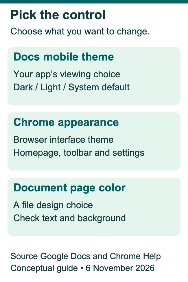
A dark browser toolbar can sit around a light file. That result tells you that the browser’s appearance changed. It gives you no reason to change the file’s text color unless you also want to change the file’s design.
Likewise, a dark page inside a light editor can be a deliberate file background. Read the file’s page settings before trying to fix the surrounding app theme.
When you help someone else, name the layer in your instructions. “Choose Dark in the Docs app” is more precise than “make Google dark.” It directs them to one product and one type of setting.
Understand the desktop browser’s dark appearance
Chrome has its own appearance controls. Google’s Chrome help defines its scope. Dark mode affects the homepage, toolbar, settings and some other pages. It also files Light, Dark, and Device choices under Customize Chrome on a New Tab page.
To use that route, open a new Chrome tab and select Customize Chrome. Under Appearance, choose Dark. Device is available when you want Chrome to follow the computer’s theme.
These are browser instructions. Google’s current Docs theme help gives Android and iOS steps. It does not give a desktop Docs route. Check that scope when you compare guides. A mobile screenshot or browser setting may show a different control.
If your file still looks light, inspect which part of the interface changed. A dark tab bar and a light content page can be consistent with the scope Chrome describes. First identify the setting you used. Then compare its purpose with the result you expected.
On a work or school computer, also record the browser and account context when asking for help. Include the name of the menu you opened. Name the visible control in your question. That helps support staff check the right product and setting.
Change a page background only when it fits the file
Use page color when the file itself should have a colored background. On a computer, open File, then Page setup, then Pages. Google’s page-settings help places Page color there. Choose Page color, make the change, and confirm with OK.
The same help page says Pageless files have a background-color choice. Check which format the file uses before following a screenshot. Pages and Pageless describe the file’s layout. The mobile theme controls your app view.
For a file you intend to share, plan the background and text together. A dark page with dark text can be hard to read. A pale table cell may also need review beside the rest of a dark design.
Keep the purpose clear. A club poster may need a dark design. An essay that feels bright on your phone has a different goal. Changing the essay’s page color creates extra design work when your goal was only a private view.
If the file already has a set of agreed colors, speak with its owner before replacing them. Use light preview and the app’s theme controls to review the existing design first. Then make a file-level change only when that change serves the shared file.
Review text contrast when you choose file colors
Treat readable text as part of the design. W3C’s WCAG 2.2 contrast criterion calls for at least 4.5 to 1 for ordinary text. Its large-text threshold is 3 to 1. Those web-content thresholds provide a useful reference when you choose your own colors.
Use those thresholds as a reference when you check the text and its background together. Review each custom label, image, and shaded cell so that the whole design stays readable.
For an illustrative review, compare a small gray caption with a main paragraph. The main paragraph may be easy to read while the caption fades into the background. Fix the specific color pair or text size that causes the problem.
Also use words to explain meaning. Google’s file-accessibility help advises against relying on visual formatting alone. A label such as “Action needed” explains a warning. It helps when the reader cannot tell the colors apart.
Review headings, links, table text, and captions separately. These parts may use colors that differ from the main body. Keep the result readable in the view your audience will actually use.
Keep images and screenshots clear
A file can contain a mix of text, photos, logos, and screenshots. Review the image’s own content when you check a dark view. A white box inside a screenshot may be part of that captured image.
Use context to decide whether a visible edge is a problem. A screenshot that shows a light app should still explain the light app’s controls. Changing its colors to match the page could confuse readers. Keep the image faithful to its source.
For an original diagram, make labels and source credits readable at the size readers will see. Keep a label beside the feature it explains. A caption should say what the image shows. Do not make readers guess its meaning from a color alone.
Some Android display settings change colors more broadly. Inspect images with care if you use one. Google’s Android accessibility help says color inversion affects media too. It also says dark theme’s expanded option can alter images or make text over images hard to read.
Those are separate device controls. If an image’s colors look wrong, check whether one of them is active before editing the source image. Keep a clear original while you identify the cause.
Check permissions before choosing a browser extension
A desktop extension may offer a different page view. Read its current listing and requested access first. Google says some extensions need permission to read and change site data. Compare a tool’s purpose with the data it can access.
Chrome’s help explains the site-access choices. These include use when selected, one-site access and all-site access. The permissions available depend on the extension’s requested access. Review the actual options rather than assuming that a color tool has limited reach.
For a work file, check your organization’s policy before using an extension. Google’s help notes that organizations can block some extensions. The color you prefer is one choice. Whether a tool suits a shared work file is another.
Do you already use an appearance extension? Inspect its setting if a file looks unusual. Use Chrome’s extension controls to turn it off for a comparison. Then inspect the file again. Keep the source file unchanged during this check. Find the display setting that caused the difference first.
Diagnose an unexpected theme with a short record
Record the product, device, and active choice before you troubleshoot. A useful note might say “Docs app on Android, Choose theme set to Dark.” Another might say “Chrome on a Mac, Appearance set to Device.” These point to different controls.
Then describe what stayed light or turned dark. Name the menu, page, image, or text area. A statement such as “the toolbar is dark, but the page is light” narrows the question much more than “dark mode failed.”
Make one change at a time. Changing all four layers at once hides the cause. Keep each app, device, page and extension change separate. Return to the setting that matches your goal and check that result first.
If you ask for help, share the route you followed and the labels you see. Avoid including private file text in a screenshot when the menu alone can show the issue. A clear description of the control helps start a useful support chat.
Check the version your audience will receive
Your private viewing choice is only one part of a handoff. Review the file you intend to send or print. Check its page color, text colors, images and captions.
For a downloaded file, open the downloaded file in the reader’s intended app. For a printed handout, inspect the print preview and a sample when the output matters. This checks the actual result. Each viewer or printer may show the file in a different way.
For an illustrative school worksheet, read one complete question and its answer area. Check that a shaded box still leaves room for a readable response. For a team file, write the current status in words as well as showing it with color.
If you find a problem, correct the file design and review the new output. Keep the app’s private theme separate from the file you are fixing. That gives the next reader a clear file while leaving you free to choose the view you prefer.
Did You Know?
Google says collaborators cannot see the mobile theme you choose. Two people can use their own themes in the same file. Use the file’s design controls when you want to change the file itself.
Conclusion
To change Google Docs to dark mode on mobile, start with the app’s theme setting. Choose Dark, Light, or System default to fit your routine. On a computer, identify whether your goal concerns Chrome or the file’s background. Then review the actual content and the final file your audience will receive.
FAQs
Will choosing Dark in Docs also set the theme in Sheets and Slides?
Check the setting in each app you use. Google gives theme steps for Docs, Sheets and Slides. You choose through each app’s own menu. When you want them to follow the device, inspect System default in each one. Confirm the visible result rather than assuming a choice in one app changed every app.
Why can a photo still have a white background in dark theme?
The white area may be part of the photo or screenshot itself. Review the original image and compare the file in light preview. Keep an illustration faithful to what it shows. Check any active device-wide color controls too. Do that before changing the source image’s colors.
Can I choose a custom dark color for the Docs app theme?
Google’s mobile help lists Dark, Light, and System default. Page color and text color are separate file-design choices. Choose those when you want to design the file, then review the text and background together. A custom page color serves a different purpose from the app’s listed theme choices.
Do I need editing access to use my own mobile theme?
The theme setting controls your app’s view. Google says collaborators cannot see your choice. File-editing rights concern changes to file content and design. If a page-color command is unavailable in a shared file, check your access. Use the app’s own Settings when your goal is a viewing choice.
Will System default always stay dark?
System default follows the device’s theme. Use the explicit Dark choice in the Docs app when you want a fixed dark choice. Did the view change without warning? Inspect the app and device choices first. Do that before changing the file. Keep a note of which control produced the result you wanted.
References
- Google Docs Editors Help — Use Dark theme on Android
- Google Docs Editors Help — Use Dark theme on iPhone and iPad
- Google Chrome Help — Browse in Dark mode or Dark theme
- Google Docs Editors Help — Change page settings
- Google Docs Editors Help — Change between Pages and Pageless
- W3C — WCAG 2.2 text contrast rules
- Google Docs Editors Help — Make documents more accessible
- Google Android Accessibility Help — Turn on dark theme and color inversion
- Google Chrome Help — Install and manage extensions
- Google Drive Help — Learn more about access to Google files
