

Choose a layout that fits the reading task
Set up text columns, keep titles clear and fix awkward breaks. Use simple examples to plan width, compare tables and check the final output.
Key Takeaways
- Use a computer and Pages format to add text columns in Google Docs.
- Select the passage first, then choose Format, Columns and the layout you need.
- Use a column break when the next passage must start at the top of the next column.
- Choose a table for related data. Keep a single column when your readers need a simple screen layout.
Your newsletter looks fine until you try to move a paragraph to the right. Spaces do not line up. Extra blank lines move when you add a sentence. The page needs a layout rule, not more typing.
To make columns in Google Docs, open the file on a computer in Pages format. Select your text, choose Format, then Columns, and pick a layout. Google’s column guide confirms that route. You can keep a full-width title above the selected passage and use columns for the body below it.
The useful part is knowing which text should flow together. A newsletter story needs a reading path. A price comparison needs rows. A handout needs room for a reader to follow the steps. This guide helps you choose a layout. Build it, then check how it handles edits.
Decide what belongs in columns
Think about the order in which someone should read your page. In a text column layout, a story continues through the available space. The columns are part of one reading path. They are useful for a short printed bulletin, a newsletter or a compact event handout.
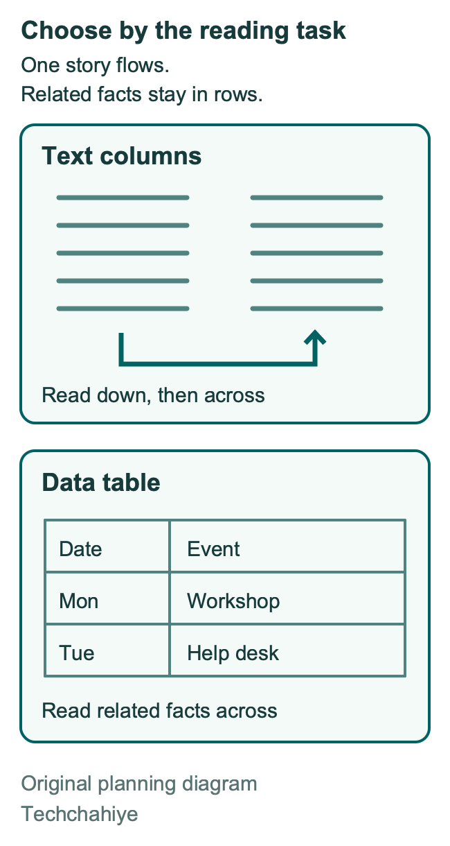
A table has a different job. A reader may need to compare a date in one cell with an event in the next. Those facts belong together across a row. Putting them into flowing text can make the relationship hard to see.
For example, imagine a club update with an opening note, three news items and a contact line. The title and contact line can span the page. The news can sit in two columns. Now imagine a club schedule with a time, room and activity. That is data with a clear row structure, so a table is the stronger choice.
Google’s accessibility guidance recommends tables for data rather than page layout. Keep that advice in mind for side-by-side blocks. A borderless table may hold them in place. It can still give the reader a poor path. It may look tidy to you while giving someone else a less clear route through the page.
| Reader’s job | Useful starting layout | Reason |
|---|---|---|
| Read a short printed bulletin | Two text columns | The story has one reading path |
| Compare dates with events | A table with headings | Each row keeps related facts together |
| Follow a long set of instructions | One text column | Steps stay in a simple sequence |
| Read mainly on a small screen | A simple screen-friendly document | Narrow print columns may need more zoom |
Treat the table as a design guide, not a rule that every document must follow. Your content and your readers decide whether the added layout helps.
Set up the page before the columns
Google’s page setup guide separates Pages from Pageless. Pages gives the file a page-based layout. Pageless provides a continuous reading area that adjusts to the screen. Text columns need Pages, according to Google’s documentation.
On a computer, open File, then Page setup. Choose Pages and confirm with OK. If your document already has a complex layout, work on a copy before making broad changes. Give the copy a useful name, such as “Club newsletter layout.” That keeps the purpose clear when you return to it later.
Next, settle the paper size, orientation and margins. Google’s page settings help lists those controls in Page setup. Pick the paper your reader will use. A US office handout and a document printed on A4 paper may need different page settings. Do not rely on the paper size you happen to see when you open the file.
Avoid squeezing the margins to make the content fit. A narrow margin leaves less room for printing or notes. A crowded column may need a text edit. Try the normal reading view. Check print preview too. Do that before you make the type smaller.
Choose a page layout early because width affects the rest of the design. If you change the page after you place breaks and images, review those choices again. The words may be the same, but their position can change.
How to make columns in Google Docs
Google’s official steps begin with a selection. Highlight the passage, open Format, choose Columns and select the number you want. For more settings, select the columns. Return to that menu. Open More options. Make the changes you need and choose Apply.
Start with a short passage so the result is easy to inspect. Make sure you selected the first and last words you intended to include. A missed paragraph can leave an odd strip of full-width text above or below the columns.
Look at the result before adding anything else. Read the end of the first column and the start of the next. Check that the order makes sense. Then add a sentence near the start of the passage. This small check can reveal a layout built with manual spacing: it tends to need repairs as text moves.
If you are converting a long draft, do the work in a copy first. Check one section at a time. Keep each change small. Check one passage before you move to the next.
Do not press the space bar over and over to create a second column. Spaces belong inside text. They are a fragile way to place blocks on a page. The same applies to long runs of blank paragraphs. A layout should survive a normal edit without making you rebuild its shape.
Keep a title above a column section
A full-width title gives the page a clear starting point. It can also help when the title is too long for a narrow column. Keep the title outside the body selection when you apply the column format.
Plan the boundary in words first. A newsletter may start with a title and date. Then comes a short introduction, the news and a contact line. Only the news section needs the column layout. A clear plan helps you see whether the selection includes too much.
Google’s break guide explains section breaks and how to show them. Use View, then Show section breaks when you need to understand the boundaries in an existing file. These markers help you inspect the structure; they are not extra article content to type.
A section boundary and a blank line do different jobs. A blank line adds space. A section boundary separates parts of the layout. Check stray space before you delete it. It may mark a change in the layout.
You can add a layout note to a reusable file. Keep it outside the reader copy. For example: “Keep the headline full width. Put the news body in two columns.” Remove that note before you distribute the finished page. A useful template should make the next issue easier to build. Tell the next editor how it works.
Start a new passage with a column break
Google describes a column break as a way to move the next text to the top of the next column. Place the cursor at the intended point, then choose Insert, Break and Column break. The document must already have at least two columns for that option to be available.
Use the break for a real editorial reason. The right column may need to start with an event heading. That is different from forcing each column to hold exactly the same number of lines. The content may need more room on one side than the other.
Before placing the break, finish the sentence and check the next heading. Read the page as a reader will. Does the break end at a natural pause? Does the next column begin with enough context? A sentence that starts halfway through an idea can make a neat page feel confusing.
Do not use repeated returns to push the next passage over. You will need to adjust those returns when the earlier text changes. A named break records your intent more clearly. Still, a break is not a promise that the final page will look good after every future edit. Check it again when the copy is final.
Work out the width before shrinking the type
A column’s width depends on the room left after margins and gaps. You can estimate that space before you spend time trying layouts. The following figures are a hypothetical design example, not Google’s default settings.
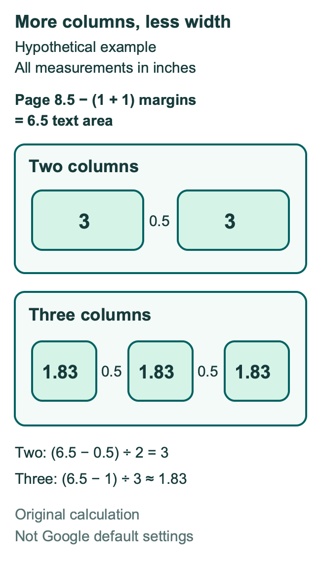
Imagine a page that is 8.5 inches wide. Give it a 1-inch margin on each side. The text area is then 6.5 inches wide: 8.5 minus 1 minus 1. If a two-column design has a 0.5-inch gap, 6 inches remain for the two columns. Each column is 3 inches wide.
Now use the same page and margins for three columns. Two gaps of 0.5 inch use 1 inch in total. That leaves 5.5 inches, or about 1.83 inches per column. The extra column has made each reading line much shorter.
| Hypothetical layout | Total gaps | Width per column |
|---|---|---|
| Two columns | 0.5 inch | 3 inches |
| Three columns | 1 inch | About 1.83 inches |
The arithmetic shows the tradeoff. It does not tell you which font size to use or prove that one design is more readable. Long words, headings and images still need a visual check. A three-column page that works for short notices may be awkward for a detailed guide.
Try two columns before three when the text includes long terms or step names. If the lines look cramped, simplify the layout before cutting the font size. A reader should not have to work harder because the page looks more compact.
Build a small newsletter without layout debt
Here is an original planning example for a community technology club. It is not a tested template or a claim about reading speed. The goal is to show how a layout decision follows the content.
Start with a full-width title and the issue date. Below that, write a short opening note. Keep it brief enough to tell readers what is in the issue. Then select the news body and try two columns. Give each news item a useful heading that says what changed.
Suppose the first item is a laptop workshop and the second is a phone help session. If the phone section needs a fresh start, place a column break before its heading. Do that after you have edited the two items. Otherwise, a large cut in the first item may leave an avoidable gap.
Keep the contact line outside the news section if it needs the whole page width. Read it at the size a person will see on paper. A phone number that looks fine while zoomed in may be too small in the final output.
Ask one reviewer to read for sense before they comment on the design. They should be able to identify the date, main update, event details and contact route. If they cannot, adding a line between columns will not fix the missing information. Edit the words first.
The final pass is about consistency. Match the heading styles. Remove stray blank paragraphs. Check each image and its caption. A simple two-column page can look finished when those small details agree.
Fix the cause when columns look wrong
If the Columns option is missing, first check Pages versus Pageless. That is the format limit Google documents. Next, confirm you are using the computer version. Do not waste time looking for the same controls in the mobile app.
If the wrong passage changed, inspect your selection and the nearby boundaries. Work on the smallest affected passage you can identify. A broad selection may pull a title, a footer note or an unrelated list into the new layout.
If the right column begins too low, look for blank paragraphs or a misplaced break. Do not add more blank space to cancel the space you already have. Show the structure, find the cause and make one change at a time.
If a heading lands at the end of a column without its text, consider whether the break belongs earlier. Another option is to shorten the preceding passage. Keep the heading meaningful; a shorter vague heading may save a line while making the page harder to scan.
If images seem too large, compare them with the available column width. A wide diagram may need its own full-width section. Avoid shrinking the graphic until its labels become too small. The information in the graphic matters more than keeping every item inside the same grid.
If the page has too many gaps, review your forced breaks after the final copy edit. Each break should have a reason you can state. “This new topic starts here” is a reason. “It happened to look even in an earlier draft” is a cue to reconsider it.
Change the layout back without deleting your writing
Google gives this removal route. Select the columns and open Format. Choose Columns, then one column. That changes the format rather than asking you to delete and retype the content.
After changing it, scan the text from the start of that passage to the end. A sentence should follow the sentence before it in the order you expect. Then look for extra space, headings that need attention and graphics that need a wider view.
If the file came from another editor, avoid making several layout changes at once. Return one section to a simple format and review it. This gives you a known starting point for the next change. It also helps you explain the repair to the person who maintains the file.
You do not need to keep a complex layout because it took time to build. The file may now be a long guide. Its readers may use it on screen. A single column could suit that use. Let the new use decide the format.
Check mobile use and accessible reading
Google documents text columns as a computer feature. Its Android and iPhone help pages direct you to a computer. Tables use a different feature. Do not use their mobile steps as a guide to text columns.
For a file that people mainly read on phones, review whether a print layout is the right delivery format. Open the finished output on a small screen. Check the size of the text, the reading order and whether the reader must keep moving sideways to finish a line.
Google’s accessibility guide recommends clear headings and useful alt text. It also favors large, left-aligned text where possible. Apply those principles to the whole document. Real headings give the page a structure beyond visual size. A caption explains an image for sighted readers; useful alt text serves a different need.
Keep important instructions in text rather than only inside a picture. If a graphic shows a reading order, explain that order beside it too. If color separates two ideas, name the ideas in words. These choices help in a gray printout. They can also help people who use assistive tools.
Review the output and keep a clean starting file
Google supports downloading a copy through File, then Download and a file type. Its printing guide also documents File, then Print. Inspect the actual output you plan to send. The editor view cannot show every reader’s experience.
Google documents a tab choice for print and download. Choose the current tab or all tabs. Check that choice before you send the file. A perfectly formatted page is not useful if the export leaves out another part your reader needs.
Read the first line, the column transition and the final line on every page. Those points often reveal a cut-off item or an awkward break. Check the title, date, contact details and image labels separately. They are easy to overlook because you already know what they should say.
Google’s template help describes making a copy of a file. Once your layout works, keep a clean source copy with sample text that explains each space. Use a fresh copy for the next issue. Do not overwrite the only finished version to reuse its design.
A final output check
Confirm the title, date and contact line. Read each column transition. Check image labels at the final size. Choose the correct document tabs before export. Keep a clean source copy for the next issue.
Did You Know?
Pageless text width is a viewing preference, not a substitute for text columns. Google says this width choice affects your view. It does not change the view for other editors. Two people may see different line lengths. Check their views first. The content may still be the same.
Conclusion
Make the page structure do the work. Set Pages format, select the right passage and choose columns. Add a break only when the next passage needs a clear start. Then read the final output in the order your audience will use it.
For your next document, begin with one question: is this a story, a comparison or a set of steps? That choice will tell you more about the right layout than the number of columns that fit on a page.
FAQs
Can I make text columns in Google Docs on my phone?
Google’s help pages say that this feature requires a computer on both Android and iPhone or iPad. Use the desktop instructions to set up the layout. Table columns in the mobile app are a separate tool and should not be confused with flowing text columns.
Why is the Columns option missing in Google Docs?
Check whether the document is in Pageless format. Google requires Pages for text columns. Open Page setup on a computer and review that choice. Use the computer text-column controls. Table tools and mobile menus serve other tasks.
How do I move text to the top of the next column?
Use a column break at the point where the next passage should start. This is useful for a new section heading or a distinct notice. Avoid blank paragraphs that push text down. They add space but do not mark a clear transition.
Should I use columns or a table for side-by-side text?
Choose by the reading task. A story that continues through a page can suit text columns. Related facts that readers compare across a row belong in a table with useful headings. For unrelated material, try a plain sequence of sections. It may give readers a clearer path.
How do I remove columns without losing the text?
Select the affected passage and return it to a one-column format. Then review its order, headings and spacing. You are changing its layout, so there is no need to delete the writing and start again. Keep a copy first when you are repairing a complex shared file.
References
- Google Docs Help: Add or delete columns in a document
- Google Docs Help: Change a document’s page setup
- Google Docs Help: Change page settings
- Google Docs Help: Add page breaks and move margins
- Google Docs Help: Columns on Android
- Google Docs Help: Columns on iPhone and iPad
- Google Docs Help: Make documents more accessible
- Google Docs Help: Create, view or download a file
- Google Docs Help: Print a file
- Google Docs Help: Use document tabs
- Google Docs Help: Use templates
- Techchahiye: Change the default font in Google Docs
- Techchahiye: Make a table of contents in Google Docs
- Techchahiye: Productivity Apps Guide
